I'm Mike Hatfield, and welcome to my tracking data visualizationwebsite. I'm a data scientists with experience in computer vision and machine learning, and an entusiasm to waste my time watching any spors I can. Making this website has been a semi-productive way to combine the two. Read through any of the below sections to learn more about how this website has been developed and structured, the data processing, the animation, and a handful of other research questions I've tried to explore.
This website is built using a combination of AWS resources. An EC2 instance to support the flask server, an S3 bucket to store the data for display in the lists and animation, and Route 53 for handling the domain name routing and health checks.
Earlier iterations of this website started with less scalable and resilient architectures. Data storage originally began by simply storing the json files foreach play in the EC2's local file directory from where the flask server is run.
You can see in the Future Development section that there's additional work planned to improve the cloud architecture. The next focus in this area will be creating health checks for the EC2 instance (rerouting to a static S3 webpage when unhealth). And if this website ever gets visited at a reasonably regular volume, I'll need to build out a structure using Load Balancers and Auto Scaling Groups.
The data visualized in this website pulls from two sources. The first is directly from the data supplied by the Kaggle Big Data Bowl 2021, which only includes player tracking data for those involved in passing plays (i.e.: no OL or DL unless playing in coverage), and data starts with the hike, and ends with the dead ball call. The second is player tracking data pulled directly from sportradar for 5 test games. The player tracking data for these games includes all 22 players, and data starts at the huddle, and goes well past the dead ball call.
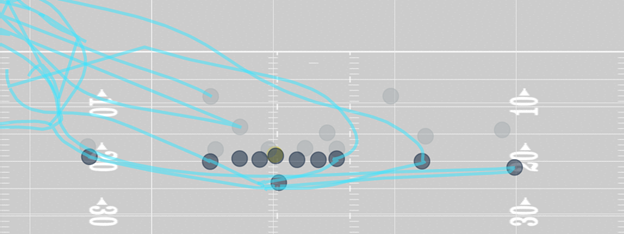
With those differences in mind, the tracings for the Big Data Bowl games looks quite clean. However, the tracings for the “raw” datasets, look a bit messier, seen here (Q1 (4:59) (Shotgun) J.Goff pass short right to T.Gurley for 19 yards, TOUCHDOWN):
These 5 test games are from 2018 so it’s possible the metadata for each play has been updated since, however, they don’t include timestamps for the hike or dead ball. But we can successfully automate that process using existing change point detection algorithms. With a python library called ruptures, we can plot the ball’s velocity (y-axis) against time (x-axis) to get a view that looks like this:
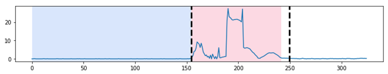
The blue and red sections represent the labeled points for the hike (end of blue) and dead ball (end of red) times. The dotted lines are the predictions from the change point detection algorithm. You can see in this representative example that the hike time is accurately predicted, and the dead ball time is closely predicted, which will be good enough for visualizing the animation tracings for our purposes.
Lorem ipsum dolor sit amet, consectetur adipisicing elit, sed do eiusmod tempor incididunt ut labore et dolore magna aliqua. Ut enim ad minim veniam, quis nostrud exercitation ullamco laboris nisi ut aliquip ex ea commodo consequat.
Game Search Page
Better sorting and filtering for games in the list
Be able to filter by season, week, team, sort the full list, or enter something into a search box
Animation Plot
Design code to have the offense always going "up" the screen
Don't necessarily want to implement this in production, but would be good to have on hand, as it seems to be the standard practice.
Animation Plot
Use Hike Time model to associate that with the play for trace plotting improvements
For the plays not pulled from the Big Data Bowl 2021 set, the tracking information starts a the huddle, and extends past the dead ball call, which leads to messy tracings for the WR, RB, and TE when trying to show passing routes
Animation Plot
Include the Player Number in the shapes
May need to adjust the player circle/shape size depending on font size required to read number
Animation Plot
Change player circles to shapes that can be directed
Either changing the circles to pointed shape, or adding an arrow would both work
Right Side Panel
Create right side panel to mirror left side plays list
Initially, use this panel to list out all the basic play information that is contained within the json file play metadata section
Right Side Panel
Display the offensive formation
Separate Task assuming this is not in the json metadata of new (2021) plays. Also require the model to predict offensive formation to be built
Right Side Panel
Show defensive coverage scheme information in right side panel
Separate Task assuming this is not in the json metadata of new (2021) plays. Also require the model to predict defensive coverages to be built
Right Side Panel
Display the Route Types in the right side panel
Separate Task assuming this is not in the json metadata of new (2021) plays. Also require the model to predict route types to be built
Cloud Architecture
Route53 Health Check
Create a Route53 Health Check where if the EC2 instance is down, it routes to a static S3 bucket website
Cloud Architecture
HTTPS Routing
Currently the website only runs using a flask server, with default settings for HTTP. Additional settings will need to be applied for HTTPS with flask, or a more robust production server will need to be used.
Data Feed
Setup games list to have access to newly available from from S3 storage
User searches through list of games on select_games.html, if not found, stay on page, notify user not found, download from API, indicate this will take time. If Found/Not Found: Search S3 ngs-player-tracking/ for that game id as listed in the button ID. If found, good to go. If Found, load all the plays same as player_tracking_html expects now, but with ID pointers going back to the S3 bucket location
Data Feed
Reach back out to sportradar about getting access to 2021 data
What it would take to have live access to 2022 data